Style Guide
This guide documents the visual identity and design principles for Project C. It's for designers, developers, and partners working across our digital platforms, branded materials, and media.
Logo & Identity
The Project C logo is the cornerstone of our brand. It should always be used with care — never stretched, recolored, or placed on a background that reduces legibility.
- Use the color logo on light backgrounds (cream, white)
- Use the white logo on dark or photographic backgrounds
- Give the logo breathing room — at minimum, its own height as clear space on all sides
- Use SVG or high-res PNG at all times for crisp reproduction
- Stretch, squish, or distort the logo proportions
- Recolor the logo outside of approved variants (color, white)
- Place the logo on a busy or low-contrast background
- Use low-resolution versions that appear blurry
Typography
Typography is the primary way we communicate. Our three-font system gives us the tools for editorial punch, readable body text, and technical precision — each with a clear role.
Journalism
| Element | Font | Weight | Notes |
|---|---|---|---|
| Page headlines, section titles | Anton | 400 (only weight) | Always uppercase |
| Body copy, deks, descriptions | Inter | 400 Regular | Line height 1.7 |
| Nav links, UI labels, captions | Inter | 500–600 | Sentence case |
| Kickers, eyebrows, tags | JetBrains Mono | 400 | Uppercase + letter-spacing |
| Stats, data labels, dates | JetBrains Mono or Anton | 400 | Anton for large numbers |
Color Palette
Our palette leads with warm neutrals and pops of coral — an editorial feel that's warm rather than corporate. Click any swatch to copy its hex code.
This animated gradient is a signature brand element — used as the top bar on every page and as a decorative accent on dark cards. The animation runs at 8 seconds and cycles smoothly.
Buttons & Badges
Buttons and badges are the primary interactive and labeling elements on the site. Use them consistently — Coral is always the primary action color.
Cards & Modules
Cards are the main content containers across the site. They come in light and dark variants. Dark cards always use the coral–pink gradient top accent.
The Creator Journalism Report
An annual look at how independent journalists are building businesses, finding audiences, and sustaining themselves outside legacy institutions.
Read the ReportProject C Members
A vetted community of journalists building independent ventures. Monthly calls, resource sharing, and peer support from people who get it.
Links & Navigation
Inline links are underlined with coral. Navigation links and CTA links in headlines do not need underlines — context and placement carry the affordance.
Nav links use Inter 500, no underline by default. Hover adds a coral background tint. The active CTA uses the primary button style (Coral, pill-shaped).
Why Project C?
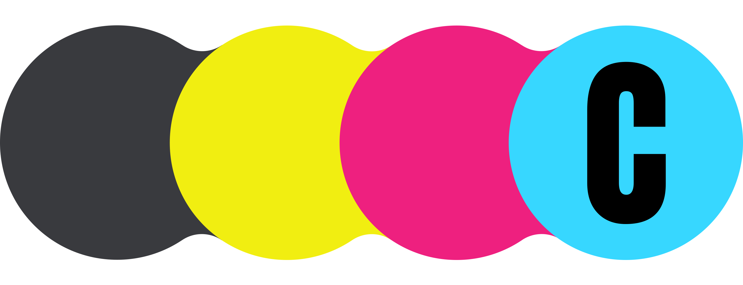
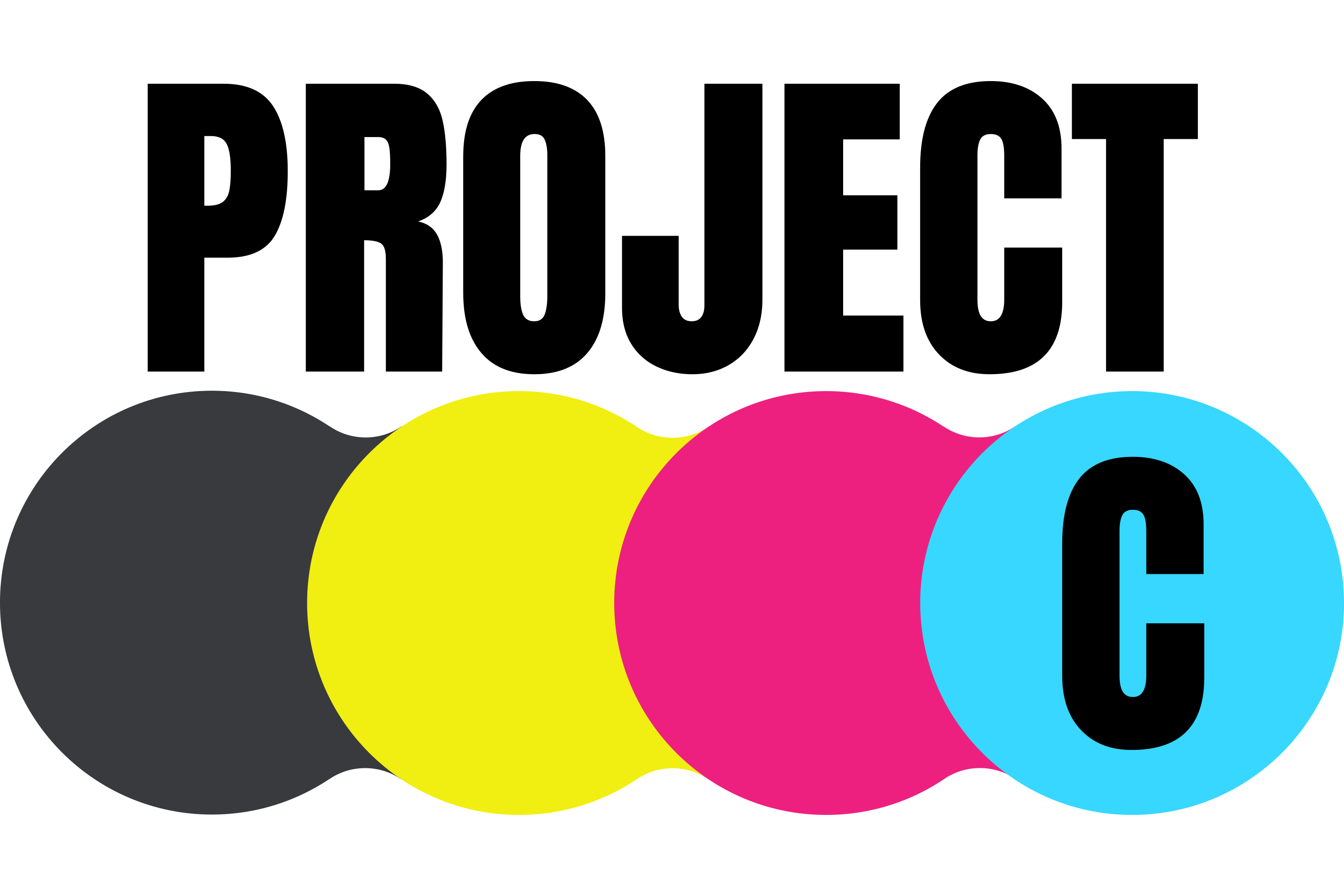
What's with the CMYK logo?
Project C started as a true project — an experiment during my Sulzberger Fellowship, where we learned the design principle of aiming for Point C, the next stage, instead of trying to leap straight to Point Z. It's about iteration, growth, and taking the next step forward. The name also stands for Creator, reflecting our mission to support journalists navigating the creator economy. And maybe it's even bigger than that — because we all have multiple projects, evolving over time.
The CMYK logo is a nod to my newspaper roots, where CMYK registration marks ensured precision in printing by aligning the presses. That same continuity and tradition now finds a new path with independent creators, who are shaping the future of journalism in their own ways.